Success has no shortcuts.
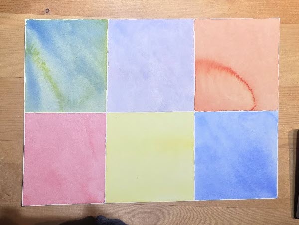
Four out of six washes were OK (red, yellow, blue, and purple) and two of the mixed colors were a disaster (green and orange). Both of the disaster blocks suffered from buckling paper. This caused the Ultramarine Blue and Winsor Yellow to separate for the green block and although this created quite a nice effect, it was obviously not correct for a smooth green wash. Although the yellow and red mix did not separate for the orange block, the concentrated pigment formed an arc as it settled in a puddle to dry.
This is what happened. The first issue I discovered was that my plywood board when placed on a kitchen counter rocked back and forth and was obviously not flat. I didn’t notice this when painting because I had set it onto two layers of table cloth and a placemat on the dining room table. Then second, when I prepped the water color paper, I thought I was successfully stapling the paper and paper tape with a new staple gun, but it was really only making an imprint on the paper tape and not shooting the staples I had loaded. So, the paper was not actually secure and pulled away from the tape and buckled when a heavy amount of water was applied (arghhh!). I had bought a “trigger” type staple gun that does make it easier for placement of the staple, but I still struggle to squeeze the handle before using the trigger and placing the staples close enough together. To make this easier in the future, I am going to try using our air compressor staple gun. That would make this part of the stretching prep quick and easy.
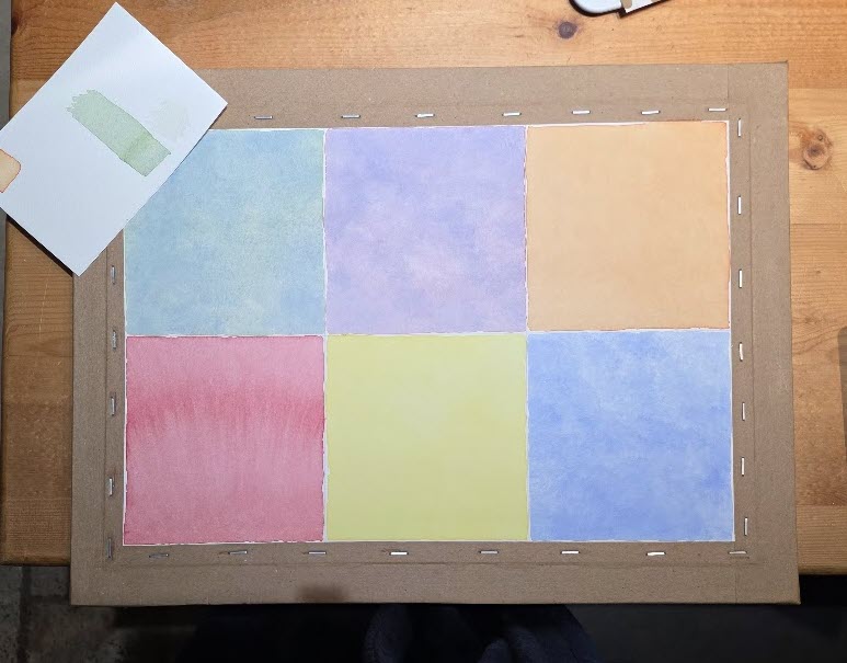
Since four out of six were OK on my first attempt, I actually started out fairly confident on this next one. However, for the red wash (lower left corner) the water pooled at the bottom edge of the block. Rather than questioning why this happened, I decided to turn on the overhead ceiling fan to speed up the drying process. Wrong, wrong, wrong! The force of the air movement pushed the settled red pigment upwards into the dry area and formed a very noticeable darker arc of pigment across the sample. Again, this was a nice effect, but totally unintended and rather discouraging since this meant the whole exercise would not pass and I was only on the first block! But anyway, onward!
Before starting on the yellow block I figured out that although I now had a perfectly flat plywood stretching board and had stapled it correctly, this time the red block fail was caused not only by the ceiling fan being turned on, but also by an out of balance dining room table sitting on an uneven travertine stone floor. My husband helped me shim the table legs and check it with a level bar. Yea!
From here on, the remaining washes were much better, yet I still struggled with the green block looking too bluish. I was aware that ultramarine blue tends to separate quickly, so this time I was very careful to mix constantly before applying. However, I believe what happened is I put way too much blue in the water before adding the yellow. I have since done a correct green test sample (shown in upper left corner) and will not make that same mixing mistake again as my eyes and brain get on the same page (ha!). It seems that ultramarine blue is such strong player that it overwhelmed the yellow addition and become the dominant color. I had started out wishing for a darker green color (or value). However, a lighter value or pastel is what I should be accepting to begin with, To make darker values, the layering comes into play. I think I am getting this.
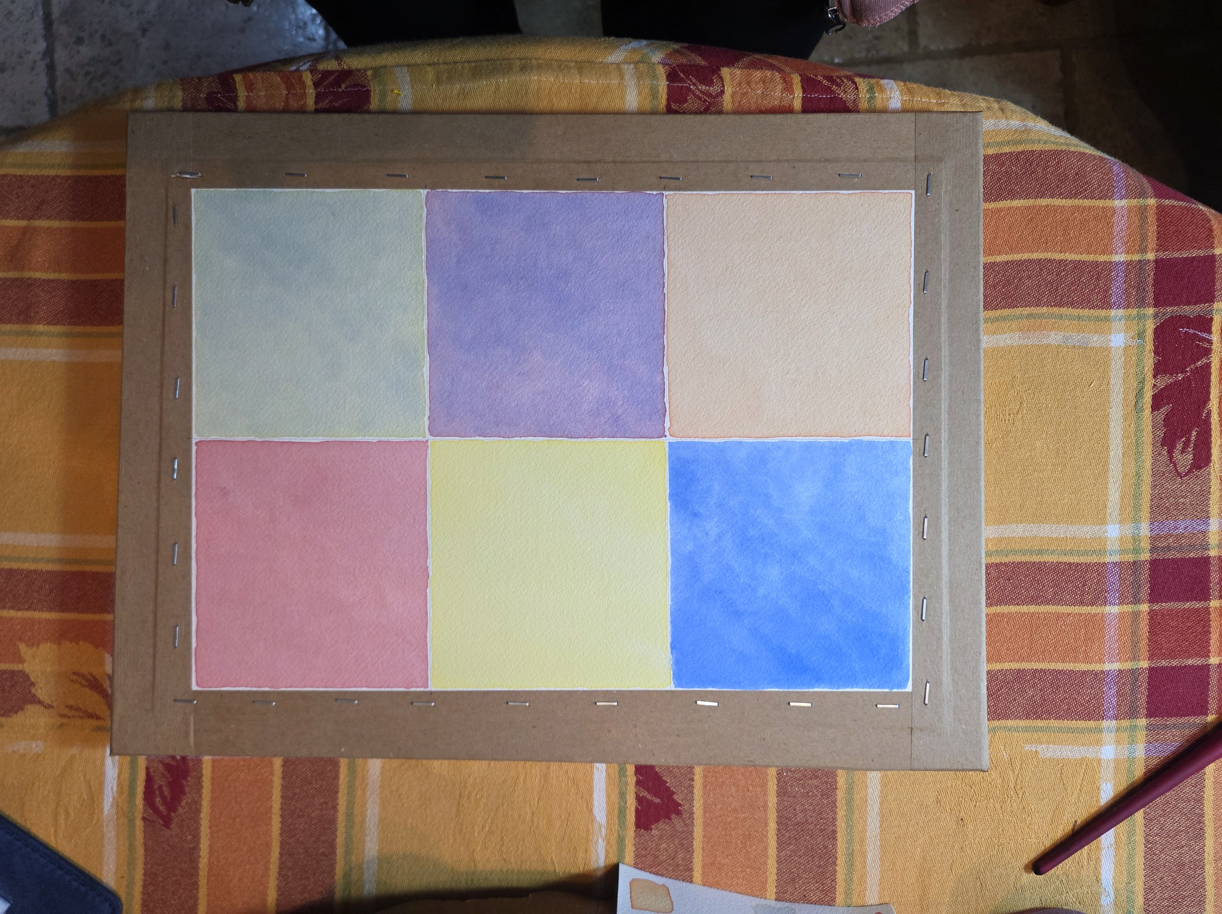
There it is! This is the final color wash exercise. The only thing I would have done differently is not make the blue and purple blocks so dark in value. They actually should be a bit lighter as a starting point for this layering technique.


Leave a Reply